Stay ahead of the game

Sign up for our newsletter to receive the latest digital marketing strategies and insights for the month ahead, delivered straight to your inbox!

    The 5 Second Rule – How to Double the Number of Leads on Your Landing Page?

    CROMarketing

    There’s no substitute for a first impression. 

    It takes us about 5 seconds to form an opinion or a conclusion about something, which in other words is known as the 5 Second Rule.

    Hence for us marketers, the first 5 seconds a user spends on a landing page are critical. That’s how long it takes them to decide whether they’d like to stay or leave our site. 

    In this short post, I want to talk about one principle that can improve your “score” when it comes to these critical five seconds. 

    But to understand what this score is made of; I’d like you to look at the first 4 questions an average user asks themselves when they land on an unfamiliar landing page: 

    1. What are they talking about on this page anyway? 

    2. Is it relevant to me?

    3. Can this site be trusted?

    4. Okay, so what am I supposed to do now?

    Pretty trivial questions, right?

    And yet, a lot of sites sometimes forget about them and do the exact opposite, which of course, ends up costing them a poor conversion rate and traffic that escapes as soon as it enters the site.

    So, to pass the test (that the user is making you take), you must adhere to a terribly simple rule that is more significant than you could possibly imagine:

    The iron rule for improving conversions: keep it simple

    Every page on your site has a purpose: A lead generation page is supposed to collect leads, a category page in an e-commerce store should get users to enter a product page; the product page should make them add the product to the cart, the shopping cart page should bring them into the checkout process, and so on and so forth.

    The principle of simplicity says that before we focus on the elements that improve our conversion ratio (i.e., a title’s copy, background image, whether to add a video or not, whether to place a form with three or two fields, and whether to make a button green or red), we first need to make sure that the overall experience of our page is simple and that a user can answer the 4 questions I mentioned above.

    1. Simplicity will help a user quickly understand what the landing page’s topic is.

    2. Simplicity will also help them decide whether that topic is relevant to them or not.

    3. Simplicity creates trust. Visually noisy pages, on the other hand, appear cheap. Minimalism conveys luxury and reliability.

    4. Finally, simplicity will help the user quickly understand the following action they need to take to move forward.

    Champions tip: To know if your site passes the 5-second test or not, let an outsider look at the site for 5 seconds and then ask them, “what’s the main benefit that this site can give you?”

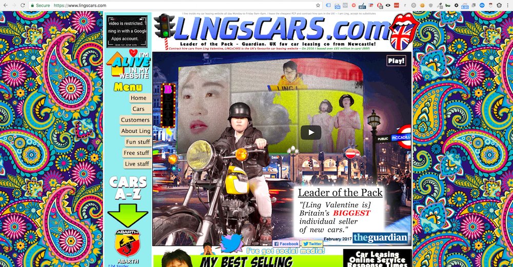
    The ugliest site in the world

    To illustrate, tell me what you think of the following site:

    So the truth is that this is not a good example because this site made 106 million dollars(!!) in 2015, but you can agree with me that when you first visit it, you really have no idea what you are supposed to do on it. 

    Why is that? 

    Because it does not maintain the principle of simplicity.

    How do you do that in practice?

    First, you need to ask yourself what you want the user to think/feel/understand/know when they arrive on the page and what action you want them to perform. Then, once you’ve defined the action, every time you come to add an image/video/form/banner/link or anything else – ask yourself whether it is beneficial for the user or simply in their way. 

    Of course, not all pages are the same, so the principle of simplicity will be expressed differently on each page. Getting a user to visit your homepage and want them to make a purchase? That’s no problem. But the purpose of the homepage is to kindly welcome the user to your site while giving them a pleasant feeling so that they will continue to browse the site. Thus, not sure it would be a good idea to add a pop-up inviting them to join your newsletter the minute they’ve landed on your site.

    Did a user land on your product page? Excellent. Encourage them to add the product to their shopping cart. This is not the time to encourage them to share your page:

    Here is an excellent example from a site that went to the other extreme:

    Ostensibly, what is this supposed to be anyway? Where is the picture of the product? Where is the famous Shutterstock picture of the student looking at his cellphone that we keep seeing on startup sites? (I’m kidding, of course). 

    That’s precisely the point. These guys want users to perform one and only one action – download their plugin to Chrome.

    Everything else is a bonus, so they didn’t invest in the design.

    What causes pages to appear complex rather than simple?

    There are a lot of possible causes, and I don’t wish to delve into all of them in this post, but I will list the main ones that can be easily corrected:

    1. Vacant areas

    To highlight a particular element, it is unnecessary to do it in bright marker colors. Instead, the Gestalt theory should be used, which means, among other things, that you have to put enough vacant spaces around something to highlight it. Remember that minimalism indicates prestige (and therefore also conveys credibility), which helps users concentrate on the page’s more essential elements.

    2. Color hierarchy

    The page should have only one prominent CTA. For example, even when Amazon gives a user the option to edit their shopping cart, it makes sure that the main action (“proceed to checkout”) stands out more:

    It takes us about 5 seconds to form an opinion or a conclusion about something, which in other words is known as the 5 Second Rule.

    3. A unified layout

    Each page is made up of several different areas. Make sure the layout is neat, and even if the elements are other in size, place them in identical imaginary squares.

    This is how it’s done right: 

    This is how you shouldn’t do it:

    Targeted text 

    You shouldn’t just keep writing. Instead, give the user a headline that will make it clear to them “what we’re talking about” (question number 1), a sub-headline that will provide more information, and then a CTA (call-to-action).

    Users don’t want to see on your main screen lengthy texts without a point. Note the differences between these two homepages: 

      Get exclusive CMO tips that I only share with email subscribers.

      Conclusion 

      You can write a lot more about landing pages’ UX, but the purpose of this post is to talk about simplicity, so I covered it briefly and well, simply.

      So, before you tell your graphic designer to add the fantastic video you made or the stunning photo slider showcasing your entire beautiful collection for 2021, think about whether it maintains the principle of simplicity or whether the user could manage just fine without it.

      This is true on desktop but especially on mobile, where the screen is smaller and users’ patience runs low, so seemingly trivial elements can create unwanted noise and impair conversion.

      Champions Tip: when planning the page, start by creating a design for mobile and then convert it to desktop. This will help you give up on elements much more quickly than starting with a desktop and then converting to mobile.

      Good luck!

      Share this article
      Back to top