Stay ahead of the game

Sign up for our newsletter to receive the latest digital marketing strategies and insights for the month ahead, delivered straight to your inbox!

    5 Tips to Create the Ultimate Google Data Studio Report

    Google AnalyticsMarketing AnalyticsPPCReporting and AnalyticsReporting Basics

    Many PPC managers and marketing analysts use Google Data Studio to analyze and report their marketing activity.

    So, if you want to start producing insightful Data Studio reports but are unsure how this article is for you.

    Keep reading to learn our top five valuable tips that will help you leverage your report with a few simple steps.

    5 Tips to Create the Ultimate Google Data Studio Report

    Why Using Data Studio?

    Data Studio is a great tool to tell stories using data. These stories can provide insights, validate decisions, or argue for a change in strategy. 

    Well-made reports can help you to conclude data-driven action points quickly and easily. Using this tool will assist you in creating visual and informative reports for your clients, colleagues, and team leaders.

    So, without further ado, here are the five tips to level up your Data Studio report!

    #1 Ask yourself: who will read this report? 

    As a professional marketer, you ought to provide correct data suitable to the person reading your dashboard. 

    Consider the job title 

    Make sure you understand each stakeholder’s needs and interests; for example: if the report is for C level position, the relevant metrics would be Cost, Revenue, ROAS, or Qualified Leads (as opposed to PPC-oriented metrics such as impressions, clicks, bounce rate, etc.)

    Then, identify the relevant data; for example, if I know the answer to “a,” “b,” and “c,”… I’ll be able to make the decision.

    Gather minimal data you need for each stakeholder and display only that data to them.

    Consider the client’s marketing goals

    Ask yourself, in which industry is my client operating? What are their goals? As such, store purchase goals will differ from lead generation goals, but in any case, you should display the most concise information possible. 

    Here’s an example: 

    Store Purchases

    Cost
    Impressions
    Clicks
    CTR
    Conversion Rate
    Conversion
    Conversion Value
    Average Order Value
    ROAS
    CPA

    Lead Generation

    Cost
    Impressions
    Clicks
    CTR
    Conversion Rate
    Leads
    CPL
    Qualified Leads (if measured)
    Q-CPL (if measured)
    Sale (if measured)
    CPS – Cost per sale (if measured)

    Many PPC managers use Google Data Studio to report on their activity. If you want to level up your reports this article is for you.

    #2 Visualize your data  

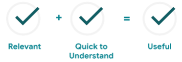
    When you report on large amounts of data, it can be very tiring for the viewer. To ease on your clients and get them more engaged, make sure to follow these steps: 

    • Familiar with the KISS principle? it’s pretty straightforward- Keep it Simple & Stupid
    • Focus on one sub-question at a time. Each element in the dashboard should provide an answer to one question only.
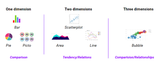
    • Choose an appropriate graph/chart. For each sub-question, find the best visualization to provide the bottom line.

    Types of Data Studio Charts

    Vertical bar charts

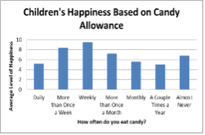
    Vertical bar charts are best for comparing means or percentages between 2 to 7 different groups.

    Horizontal bar charts

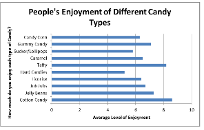
    The horizontal bar chart is used when comparing the mean or percentages of 8 or more different groups.

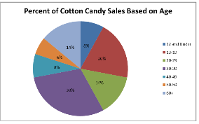
    Pie charts

    Pie charts are best for illustrating a simple breakdown in a single dimension. It is best to use pie charts to show differences within groups based on one variable.

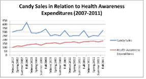
    Line charts

    Line charts are used to illustrate trends or compare two different variables over time. 

    #3 Simplify the bottom line

    Color & Icons

    It’s human nature to interpret our surroundings as simple as possible since it takes the least effort. However, the moment we face something that looks complicated, it will automatically be more difficult for us to understand it correctly. 

    The same thing goes for your data reports – Your audience’s conclusions of what they just saw versus what you wanted them to understand depends on how you presented your reports. 

    Make the report intuitive to understand. For example, if you want to make a trend look good or bad, you can use red or green colors to indicate whether the data’s positive or negative. 

    Similarly, try including icons wherever possible; for instance, a mobile phone icon will indicate mobile data.

    *Design Tip: Use the client’s logo and colors in your reports to customize them specifically for your client.  

    KPI’s Scorecards

    Most people who read your report will probably want a high-level overview of their most critical metrics. Here, the most important factors to consider are your client’s KPIs and the overall point you want to make, so ensure that everything is up-front.

    Position the client’s KPIs and main points in a prominent area on the first page by using scorecards like this:

    #4 Use Calculated Fields

    What are calculated fields?

    Calculated fields are custom formulas used in pivot table formulas to refer to other fields in the pivot table. Calculated fields enable you to create custom metrics or dimensions from your existing data. These fields can perform calculations, create categories, or transform your data.

    Why should you use them? 

    Calculated fields are a great way to answer complex questions with the data in its current state. For example, you can perform basic math formulas, apply capitalization for consistency, use “if/then/else” logic to group data and even transform multiple dimensions to analyze the data in different ways.

    By using calculated fields, you can get a deeper understanding of your data and have meaningful insights for your client.

    #5 Excellent reports are actionable

    Your report should lead to action points – what can you do to improve the performance? What should be done to maintain the good trend? 

    At the end of your report, it is highly recommended to include an action points page, where you list your suggestions for the next steps to improve or maintain performance.

    In that way, you keep the client in the loop, ensuring that after reading your report, they will understand what they need to do and what are your planned actions. Then, they can infer actionable and informative conclusions.    

      Get exclusive CMO tips that I only share with email subscribers.

      Bonus tip

      Although there are multiple ways to create a report using different versions and styles, there’s only one way to guarantee that your clients are happy with the report that you present: Just ask them! 

      There’s nothing wrong with finding out your clients’ preferences and on which metrics they would want to focus. Additionally, I’m sure they would be grateful if the reports were customized exclusively for them by considering their personal priorities.   

      Many other charts, visualizations, and features can take your PPC dashboard from good to fantastic. For some advanced tips, I suggest further reading here.

      Starting with these five tips will set you up for success and give your client a clear path for actionable insights and enhanced performance.

      I hope you found this article helpful! 😊

      Share this article
      Back to top